Kozel
KOZEL makes climbing holds for the people who shape movement on the wall. Rooted in route-setting culture, the brand reflects their creativity, craftsmanship and sense of community.
Inspired by the rhythm and arrangement of climbing holds, its visual identity combines geometric shapes, bold colours and a direct, casual voice.
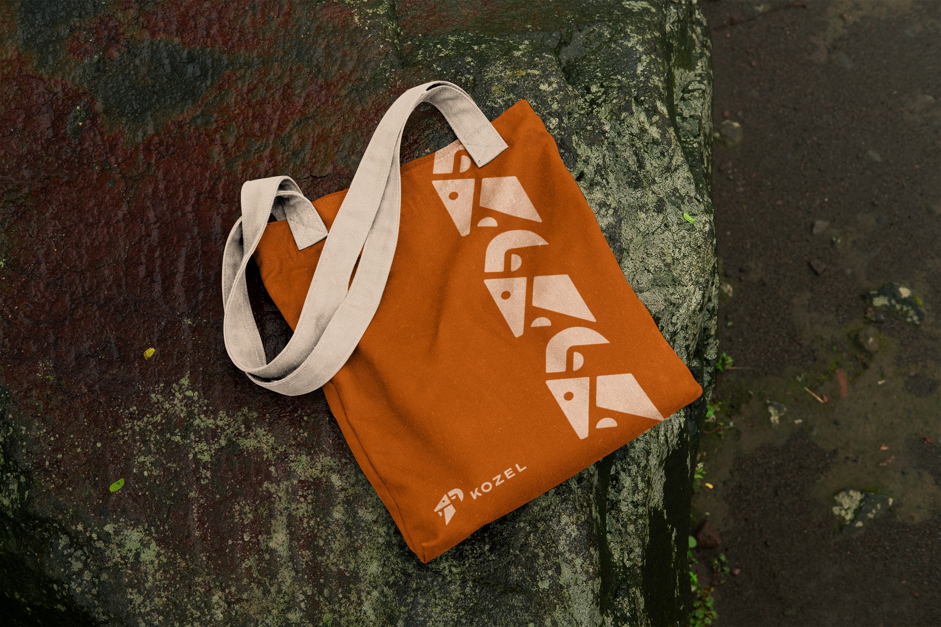
The logo depicts a goat in profile, symbolising balance, endurance and control. Its geometric shapes echo the arrangement of climbing holds, connecting the mark to the brand’s craft.

Built from the KOZEL logo, the pattern turns the brand’s symbol into a versatile graphic element for products and merchandise. Repetition builds familiarity and recognition, allowing the identity to become part of the design in a subtle, natural way.

HEX: #212121
RGB: 33, 33, 33
CMYK: 0%, 0%, 0%, 87%
HEX: #e36434
RGB: 227, 100, 52
CMYK: 0%, 62%, 77%, 11%
HEX: #cce7d3
RGB: 204, 231, 211
CMYK: 12%, 0%, 9%, 9%
HEX: #e6ebeb
RGB: 230, 235, 235
CMYK: 2%, 0%, 0%, 8%