Roza

Packaging and identity design

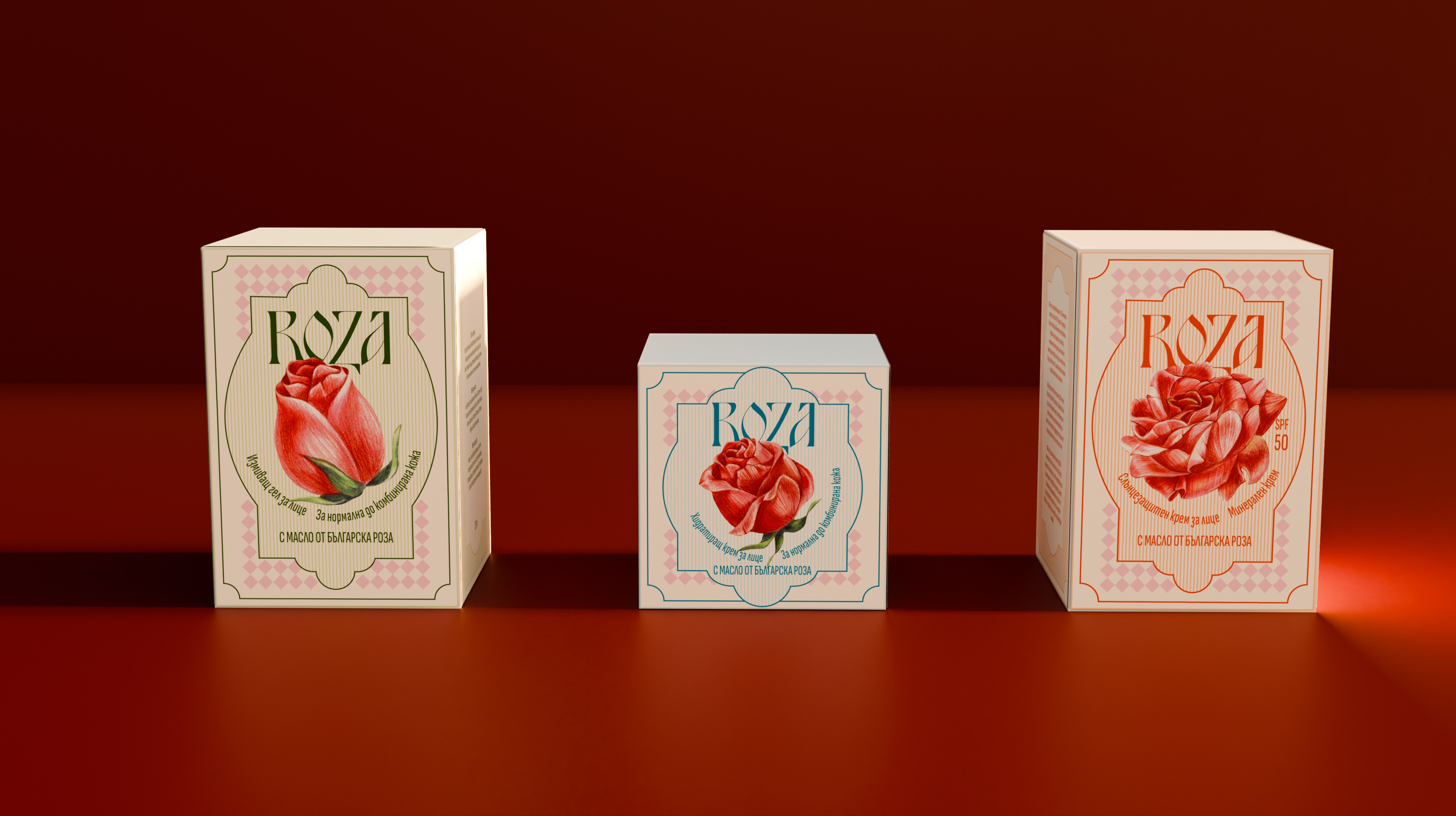
ROZA draws on traditional beauty rituals to create a skincare gift set with a vintage aesthetic. Its book-shaped packaging holds three daily essentials, reflecting beauty knowledge passed down through generations.

I developed the brand concept, logo, typography, packaging and illustrations.

The ROZA logotype taked inspiration from old Bulgarien script, blending tradition with medernity and reflecting the brand‘s deep cultural roots.

The ROZA logotype taked inspiration from old Bulgarien script, blending tradition with medernity and reflecting the brand‘s deep cultural roots.

ROZA — packaging design and illustrations

Each product features a hand-drawn rose in a different stage of blooming, visually guiding the user through the correct order of use. A stylized rose in full bloom appears on the back of the packaging, symbolizing the completed ritual and acting as a subtle brand signature.

Each product features a hand-drawn rose in a different stage of blooming, visually guiding the user through the correct order of use. A stylized rose in full bloom appears on the back of the packaging, symbolizing the completed ritual and acting as a subtle brand signature.

ROZA — packaging design and illustrations

Continue exploring

Continue exploring

Continue exploring

rozaKozelwestysm_spokofloratriangle of sadnesslilli